National Association for Kidpreneurs
Two logo redesign concepts for NAK, as part of its rebrand effort to appear more modern, attract older teens, and cut down on printing costs.
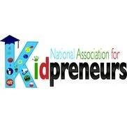
Original logo
NAK is a non-profit that helps kids under 18 develop their own businesses through classes, mentorship, and networking.
The client requested for the logo to exude fun and vibrance, while also keeping a professional tone.
Learn more about their work here.
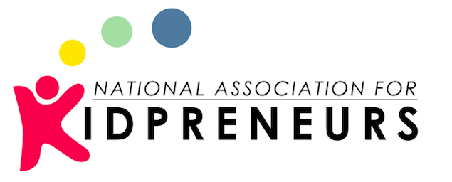
K with the colored dots functions as the logo anchor. Doubles as a child holding an excited pose.

Preserving icons from original design, showing variety of business ideas.